BOURBON+ REDESIGN
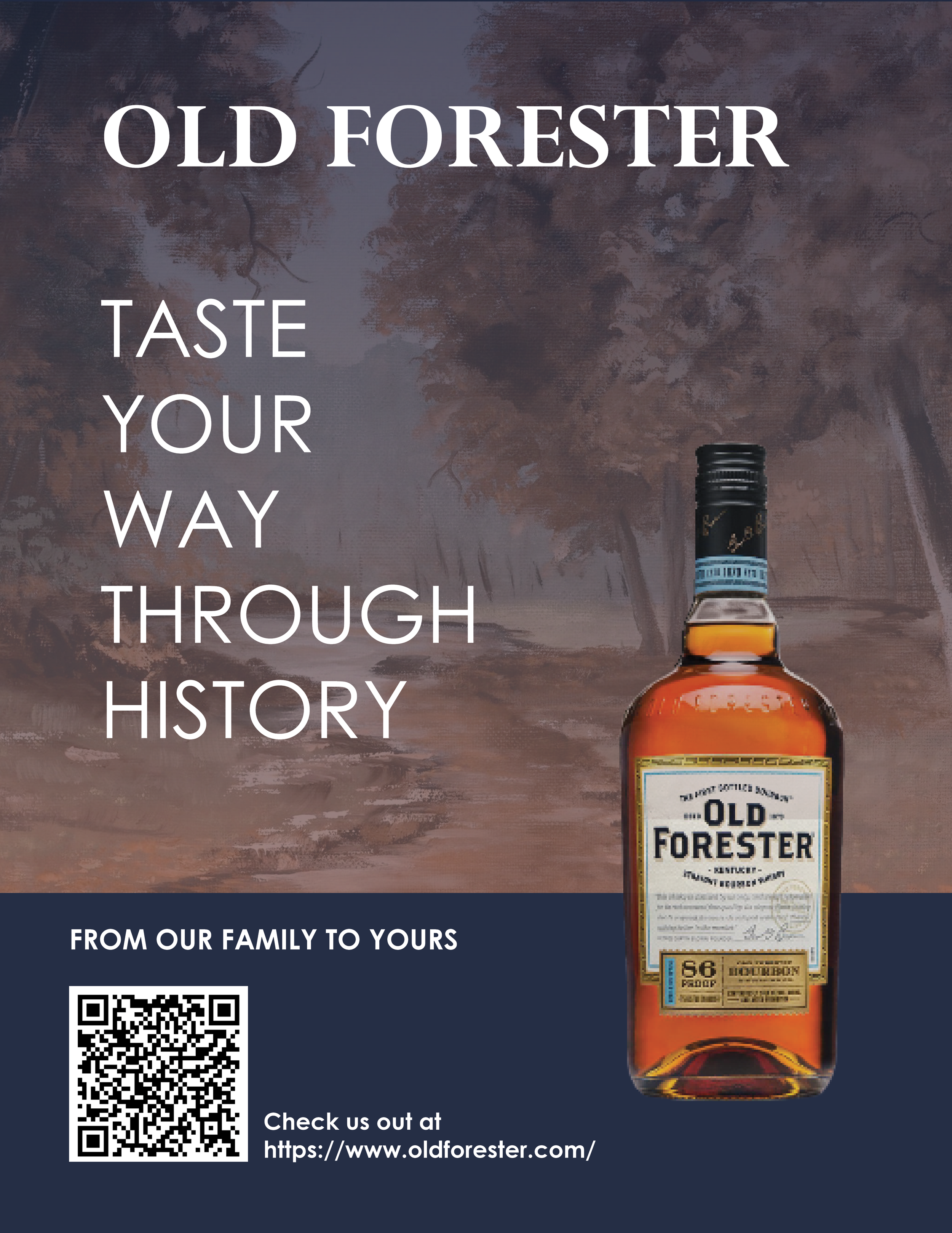
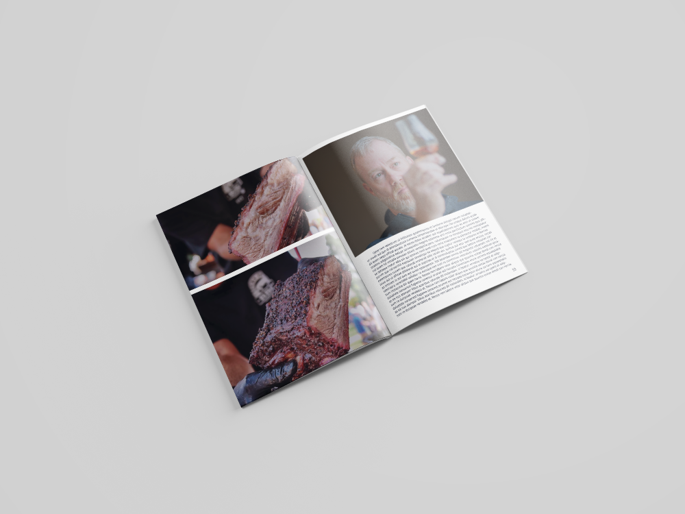
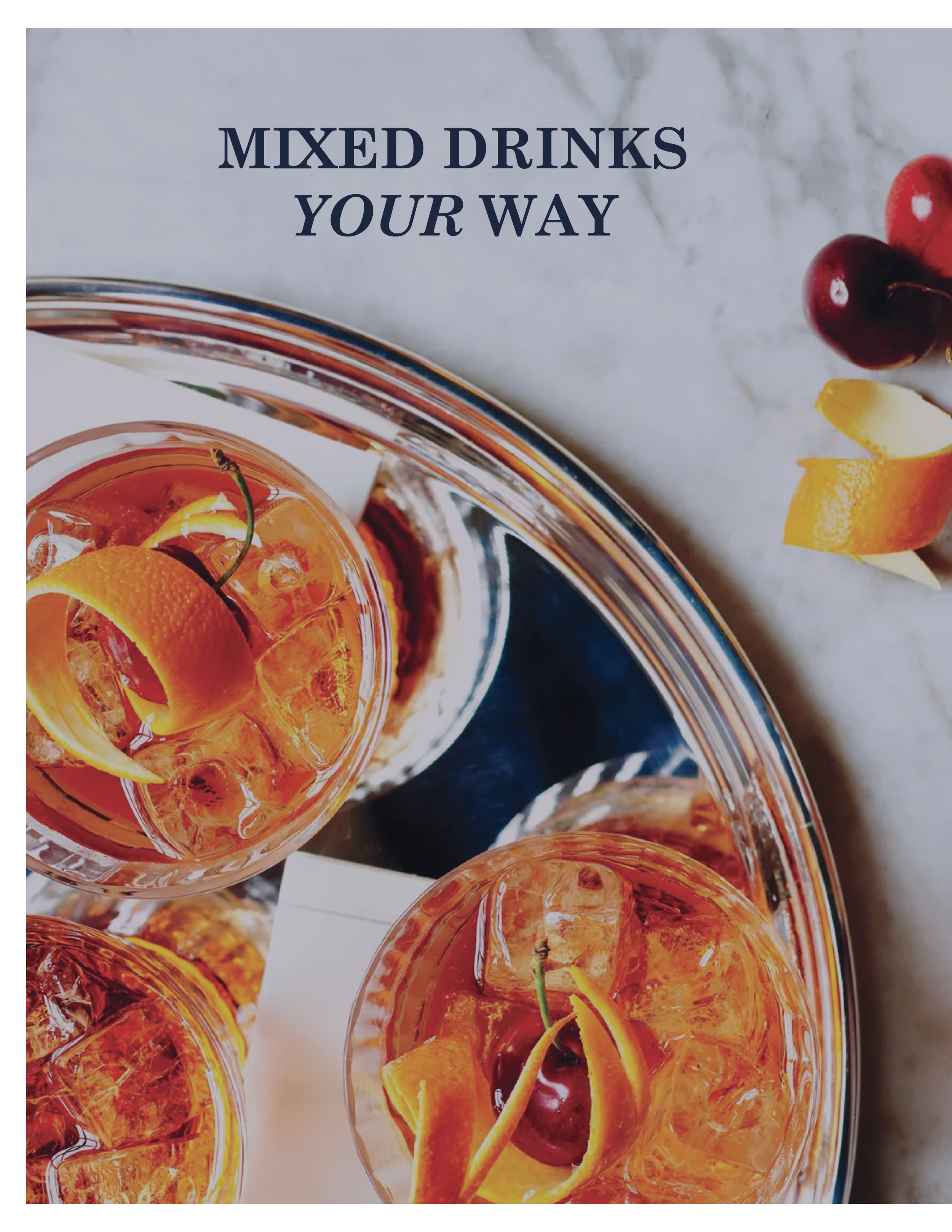
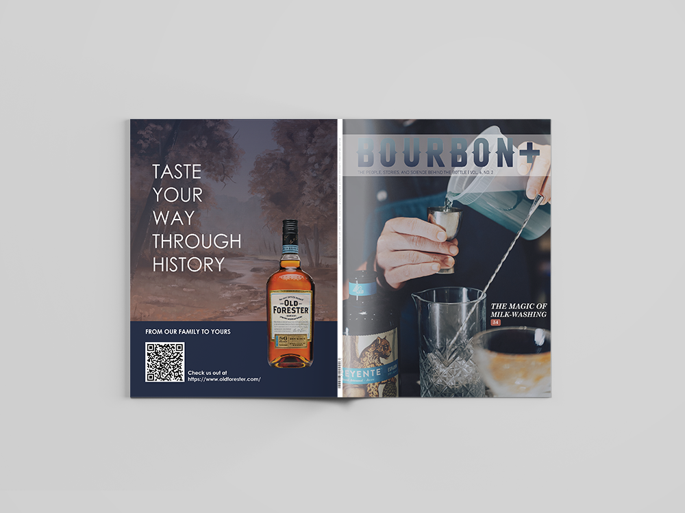
This redesign was created for the Magazine Bourbon+, after the company had offered to my Professor to let students attempt to give the magazine a fresh new look. Here I opted for shades of Blues to contrast the stark oranges and browns often show in the photography of the magazine and create visual interest.


